Stetson Kuta: Portfolio


Project Corrections / Time Spent: To be honest, I didn’t spend a whole lot of time correcting my projects because I wanted my portfolio to be filled with my work that got graded. I feel that most of my assignments are good enough not to correct. I’m not saying they can’t be improved, I’m saying that I like them as is and that is how I want my portfolio to be. At most, I spent forty-five minutes cropping certain images like my montage, brochure, and photo design project.

Message: This Portfolio was made to show off the work I’ve done, and give my audience not only a sense of how I work, but who I am. All of my projects correlate with me as a person in one way or another. So I’m hoping that you get a sense of who I am through this portfolio, not just what I can do.

Audience: Potential client and employers.

Top Thing Learned: Make sure all design elements, colors, and shapes fit your audience and message. Don’t distract with your art.

Future application of Visual Media: I really want to find ways to work this course into my personal life, whether it be for my blog or my future internship.

Color scheme and color names: Monochromatic, Blue.

Title Font Name & Category: Berthold City- Slab Serif

Copy Font Name & Category: Berthold Akzidenz Grotesk – San Serif

Portfolio


Process: I started my process by sketching out what I wanted for my portfolio. I had to determine which of my projects were better than the other, in my opinion of course. I wanted the design elements of the background to be fitting to who I was. I also decided that I wanted my color scheme to be primary with red, yellow, and blue. I searched through the templates that Power Point comes with automatically for some inspiration and eventually I found it. I’ve enjoyed this class, and definitely enjoyed doing this project. I started with red pages, but after critiquing and moving things around, this was my final outcome. I hope you enjoy it.

Critique: Over Facebook I had Isaac and Rebecca critique my work. Both had very useful advice to give, and I thank them for that. The first thing suggested came from Isaac, that I should change the solid red background I had because it just clashed too much with the images. He also suggested that I add more contrast between my fonts. So I changed the red to this gloomy blue color, and after finding a design that fit with it, I stuck with it. There is a gradient in the center going out. Rebecca suggested that I work a little more on my alignment, and she was right. A lot of my titles didn’t seem to be aligned with the slide page or my images. I also removed a colored bar I had at the bottom of every slide because it distracted too much from my central images.

Project #8: Brochure

Outside:

Screen Shot 2016-03-22 at 5.36.36 PM

Inside:

Screen Shot 2016-03-22 at 5.37.14 PM

Video:

Description: Trifold Brochure with content on the outside and inside.

Process (Programs, Tools, Skills): I decided that I wanted my brochure to be about the Salt Lake Comic Con event and I started by creating a trifold diagram in InDesign. I knew I wanted all of it to resonate to my audience, any one with an interest in pop-culture, movies, and comics, so I used a large image of the Salt Plaza being surrounded by superheroes as my background. I lowered its opacity to 46, and put a red backdrop behind it.

I then chose quality images and blended them together in PhotoShop using masks and tools before I inserted them into my brochure.

I also created a new logo for the already existing event. Since Utah is known for its mountains and high population of Latter-day Saints, I created a black, white, and blue logo of the Angel Moroni in front of some simple mountain shapes.

I did my research and gathered an idea of what sort of things occur during the comic con, and then created the body text of my brochure. I made paragraph styles so that there is a space between all of my paragraphs, rather than an indent. There is also text wrap around on of my image of Jango Fett so that the text takes shape with his body. Each Header has text wrap as well so that there is a good space between the images and headers, leaving a good amount of white space.

Message: Inform my audience about the Salt Lake Comic Con and what fun they can have during this event.

Audience: Anyone interested in comic books, pop culture, and movies: families, adults, and children.

Top Thing Learned: I learned how to modify printer settings in order to get an accurate print off of a brochure.

Color scheme and color names: Primary- Red, Yellow, and Blue

Title Font Name & Category: Krungthep/ Decorative

Copy Font Name & Category: Arial/ Sans Seriff

Word count: 400

apanel artist 12033043_1048938221803947_8894475588042308180_n

Brochure pic Brochure pic 2SLCC

afacebook1aintstagramatwitter

Panel: Chris Evans       Artist Alley       Cosplay Costumes

Power Ranger: Zeo      Superman       Ghost Buster

Walter White     Wonder Woman    Dean Winchester

Salt Plaza       Facebook     Instagram    Twitter

Magazine Spread Project

The first thing I did for my Magazine Spread Project was to make a sketch of what I had for an idea. After that I used InDesign to create a shape map for the project. IT really helped me be inspired for certain details and other things for me to add. In the sketch I listed what my color scheme would be, and what I wanted my pictures to be. This of course all changed after I had it critiqued. I didn’t want to map my out in grey, because I felt that it would throw off my ideas for the final, so I used my color scheme in the map out.

pic Screen Shot 2016-03-19 at 6.06.14 PM

But here is the final project. Thanks to some critiquing, I changed my color scheme completely. My shape map stayed the same, but my color scheme changed from primary colors to a monochromatic color scheme. I also added to new images that I feel go hand in hand with my message, more so than the light filled clouds from before. I also adjusted the size of the text box containing a quote from Elder D. Todd Christofferson. I think this layout and color scheme is perfect for my audience, which is young adults leaving their teenage years, who would be reading the New Era.

Screen Shot 2016-03-22 at 6.46.25 PM

Critique Report: Chearston Webb helped out a ton with my critiquing. She pointed out to me that my cloudy backdrop really didn’t relate to the talk, which I did agree with. She also suggested that I change my article layout into columns. I listened to her advice, though I disagree with the columns and kept them the same. Other than that a lot of good things were said, especially regarding the content of my talk. Tammy Nichols  also gave good critique, suggesting changing font styles for my title. With the yellow and blue colors, I agree, but with the new color scheme, I think the contrast between the title and body copy look great!

Fonts: Header-Handwriting Dakota/ Decorative
Body Copy: Arial/ Sans Serif

Color Scheme: Complimentary- Green and Red (contrasting cream color in the background.

Image Sources: https://christcenteredteaching.files.wordpress.com/2012/06/jesusandalostlamb.jpg

http://www.mormonnewsroom.hk/eng/article/standard-works

https://gofamintmushin.files.wordpress.com/2015/05/bigstock-man-praying-4785565.jpg

http://vignette4.wikia.nocookie.net/zt2downloadlibrary/images/b/b2/Vines.png/revision/latest?cb=20150711131634

https://edkagizi.files.wordpress.com/2013/01/plant-growing.jpg


Magazine Spread Draft Critique

The first thing I did for my Magazine Spread Project was to make a sketch of what I had for an idea. After that I used InDesign to create a shape map for the project. IT really helped me be inspired for certain details and other things for me to add. In the sketch I listed what my color scheme would be, and what I wanted my pictures to be. This of course all changed after I had it critiqued.  I didn’t want to map my out in grey, because I felt that it would throw off my ideas for the final, so I used my color scheme in the map out.

Here is what I have so far:

Screen Shot 2016-03-19 at 6.10.42 PM


pic   Screen Shot 2016-03-19 at 6.06.14 PM

Fonts: Header-Handwriting Dakota/ Decorative
Body Copy: Arial/ Sans Serif

Image Sources: https://christcenteredteaching.files.wordpress.com/2012/06/jesusandalostlamb.jpg

https://gofamintmushin.files.wordpress.com/2015/05/bigstock-man-praying-4785565.jpg

http://www.mormonnewsroom.hk/eng/article/standard-works

http://files.itproportal.com/wp-content/uploads/photos/cloud_thing_original.jpg


Web Page Layout Project

Webpage Design

Web Page Layout

IMG_0250


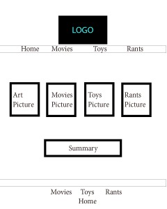
Process: I started this project by deciding I wanted to make a web page for my personal blog, the Latter-day Nerd. I began by sketching it out on paper, as you can see in the image above. After I decided on a sketch, I went to photoshop and made a very rough draft of what I wanted my webpage to be, and then I created. I used their shape tool to create boxes, and their eyedropper tool in order to choose the correct colors. I used their text tools to insert the body text of my webpage, and the logo and title was pulled straight from my blog post. After getting critiqued, I made the appropriate changes, and this one was my final. The audience I am trying to reach are people with interests in movies, comic books, and toys: parents, teenagers, and kids. The message is that this is an enjoyable website that reviews things in that category.

Critique: I actually had to change a lot from my draft, I’m okay with that because I am much happier with the final draft. Thanks to Diane Caton, I was able to see that my images didn’t really show much alignment where they were positioned, especially the first pictures which was bigger than the others. Brother Shurtliff suggested I take away the title I had inserted, and just use my logo since the title was in it. Emmalie Wells also commented on the alignment. So I took away images and inserted new ones that fit better. I made sure that the corners of my “Deadpool” image aligned with the “home” and “movies” tag. I also made sure that the tags for “Toys” and “Rants” were aligned with the corners of the text box containing my website’s summary. I also swapped a bright blue base color with the darker blue, which fits the color scheme of my log much better.

Fonts: Tags/Title: Times New Roman, Oldstyle–Body Text: Arial, Sans Seriff

Color Scheme: Complimentary: Gold and Indigo

Images:

Deadpool

Logo

Web Page Project

P7StetsonKutaScreenshot

Description: This is my web page project. It is for an imaginary business I created called Kuta Electric. I created the logo in Adobe Illustrator. I then created the HTML for my webpages, creating it’s basic content. After that I created a CSS, which makes it more appealing visually. That is how I changed the fonts, used a color scheme, and created spacing.

Process : To construct my CSS and HTML, I used an application called Text Wrangler. I am by no means an expert in this process, so a lot of it was just trial and error. I was able to post my image (logo) into my HTML, and used the Esplin Color Wheel as a reference for color in my CSS. Once I had all the text out and positioning of my content, I combined the two documents, CSS and HTML, into one folder so that they activate for each other.  I also used padding around the logo and text so that they would not be too close to the edge of the web page. This was one of the most challenging parts of working with CSS

Message: My message is that the company, Kuta Electric, is a reliable and professional business that delves into electronic set up and repair.

Audience: The audience definitely geared toward adults, but is understandable for teenagers as well. The audience is anyone who needs tech support or electric assistance.

Top Thing Learned: How to fuse HTML and CSS to the same web page.

Color scheme and color hex(s): My color scheme is complimentary, and I used my two favorite complimentary colors: Indigo and Gold.

Title Font Families & Category: Trebuchet MS, sans seriff.

Copy Font Families & Category: Palatino Linotype, old style.

Changes made to the CSS: I changed the layout ever so slightly and removed a decorative box that I had in the web page around my content.

Word Count: 221

Movie Poster Project

Movie Poster

Message/Audience: My message is definitely meant to be humorous. Anyone who has ever seen the real Tommy Boy movie will get this poster, and appreciate it. From the hammy main character, to the damaged car in the background, this captures the essence of the movie. At the bottom, I summarize this movie in one sentence for those who haven’t seen it. My audience is teenagers and older who want to enjoy a great comedy. In my cast list I added a few modern actors to the mix that will relay communication with today’s crowd: Amy Adams, Jennifer Lawrence, and Zac Efron. If this movie were made by me, and this version is, the humor wouldn’t be inappropriate to the point that your kids couldn’t see it.

Critique Report: My rough draft was a bit different than my final. I had a different font style, and extra image of a deer, and a more vibrant background. It was suggested to me by Hayden Allred that I edit and adjust my bottom text so that it fit the style of a movie poster more accurately, and that’s just what I did. Dianne Caton suggested that use other techniques to blend the car in with my scenery, and that’s what I did. I think it looks much better now. After adding shadows to my characters and vehicles, they look like they’re actually standing there than being cut out. Following my professor’s editorial, I adjusted the levels of my background so that the scenery wasn’t brighter than my characters. Now I think it looks pretty good!

Fonts/Typography: Title: Futura Condensed ExtraBold (San Serif) Body: Arial Narrow Bold (San Serif) Movie Font: SF Movie Poster (San Serif)

Images: The picture of the characters were taken by me an a roommate. The car is an image I found on the internet, same with the background road and desert.

http://howtoterminal.com/photo/stetson/DSC_1303.JPG

http://www.humbledavenport.com/wp-content/uploads/2014/06/Fotolia_61664697_Subscription_Monthly_M.jpg

http://weknowyourdreamz.com/images/road/road-07.jpg


Perspective of 12

Photography is something that I really love to do. This is my project of twelve different perspectives of an item using photography principles. I used Photoshop to edit these photos, and also to create a collage. I chose to take pictures of a Teenage Mutant Ninja Turtle figure I have based on the original comic books. During the editing process I used PhotoShop to adjust vibrance, contrast, shape, lighting, and color.

This is a collage I created using the other photos I took. It was the hardest part to do, mostly because the instructions given to make it were very unclear. Either way, I am happy with the way it turned out, though I do think it could look better.

CollageKing


Ninja Turtle Edit #1: With the focus being on the plants, I used photoshop to make sure they were sharp enough in the image. I also you used selective color to brighten the red colors in the picture. I adjusted the levels as well.

Collage1

Ninja Turtle Edit #2: In PhotoShop I used vibrance to make the colors really pop off of the figure and the plants in the background. I cropped the image down. I also used levels to adjust the color.

Collage3

Ninja Turtle Edit#3: I used sharpen in photoshop on the face of the figure; while using contrast to darken the shadows of the plants in the background.I did use the blur tool down by his feet, just to give more focus to his upper body.

Collage4

Ninja Turtle Edit #4: In PhotoShop I used vibrance to make the bright color of the turtle’s chest to pop out. The sharpening tool was used on the turtle, just to clear up the image a little better. Selective color was useful to make the red bandana more noticeable when it comes to color.

Collage10

Ninja Turtle Edit #5: The lighting outside really made the green vibrant all on its own. I only used photoshop to crop this image, and sharpen the head of the turtle and the markings on the pipe.

Collage11.1

Ninja Turtle Edit #6: Again, the outside lighting helped the green really shine in this picture. I cropped it and used selective color to make the oranges and reds darker or brighter.I also used the sharpen tool to focus on the turtle more.

DSCN0483

My critiques were given to me by Payton Mcdonald and Emmalie Wells. One suggested to change my collage, which I agreed with. It originally was a green background with mismatched sized images placed around it. I changed this by cropping the images down to the same size, and then meshing them together through layers rather than having them spaced apart. It was also suggested that I take the pictures in brighter areas of my home so that the colors stand out.


Stationery Project

KutaElec2

KutaElec1

LOGOS

Description:
Creating a header and matching business cards for a business using a logo.

Process (Programs, Tools, Skills):
I started by creating my first logo for an imaginary company called “Kuta Electric.” This logo was made by combining three diamonds together, and adding a text box with the name Kuta in the middle. I used this as a backdrop for my business card. Then I put all of my information on the card, and added the logo a second time, but that looked off. 

I used the square shape tool to create business card, measured 3.5in x 2 in.

So I decided that wouldn’t be my logo, but I would still use it as a backdrop. My logo then became an illustrated electric socket that I created with round ended squares. I also included this logo on the header of my project.

The diamond shape backdrop has an opacity of 42%. I personally think it looks awesome, and the people who critiqued me didn’t have a lot to say about it.

Programs/Tools Used: Adobe Illustrator & InDesign

Message: Kuta Electric is an electric company that installs and repairs. It is meant to be professional, but for the people.

Audience:  Anyone who needs an electrician or electrical repairs around their houses or  businesses.

Top things learned: How to incorporate Adobe Illustrator & InDesign.

Color Scheme: Complimentary colors and I used Yellow and Purple.

Fonts & Categories: Title: Avenir Next Condense-Sans Seriff — Body: Ayuthaya-Slab Seriff